
08 · Website · Product
Gryto
The product website for Gryto: it explains the "cook with what you have" idea in seconds and points interested visitors towards a sign-up.
08 / Gryto
A product website that introduces Gryto and its cook-with-what-you-have idea.
The Gryto site has a single job: land the 'cook with what you have' idea in the few seconds a visitor gives it, and turn that first spark of interest into a sign-up. A clear promise sits up top and every section builds on it, guiding people from curious to convinced before ending on one simple step: 'Try Gryto free'. No clutter, no detours, nothing competing for attention.
A clear hero states the promise right away, and the sections below show how it works in practice: turning the ingredients you already have into meals you can actually cook, with a clean, structured recipe view instead of endless scrolling. It's fast and fully responsive, so it reads just as well on a phone in the kitchen as on a laptop.
View live sitegryto.app ↗Highlights
- Hero that lands the "cook with what you have" idea right away.
- Clear how-it-works flow, from the ingredients you have to a dinner you can cook.
- Shows the clean, structured recipe view that sets Gryto apart from endless scrolling.
- One low-friction call to action: Try Gryto free.
- Fast and fully responsive, reading well on phone and ipad alike.
- Consistent branding that carries from the site straight into the app.
Homepage
A hero that tells the idea instantly
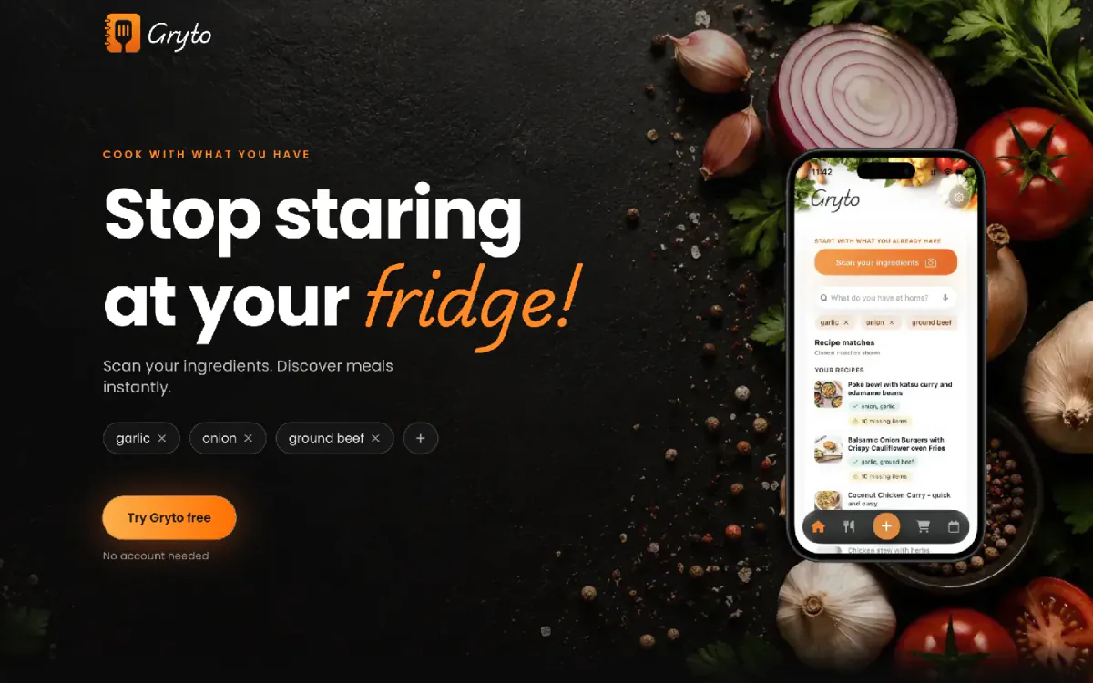
The homepage leads with the everyday problem it solves: staring at a full fridge with no idea what to cook. The promise 'cook with what you have' sits front and centre, with a short 'Scan your ingredients, Discover meals instantly' line and a low-friction 'Try Gryto free' button, so a visitor gets it in seconds.
Across devices
Sharp from phone to tablet
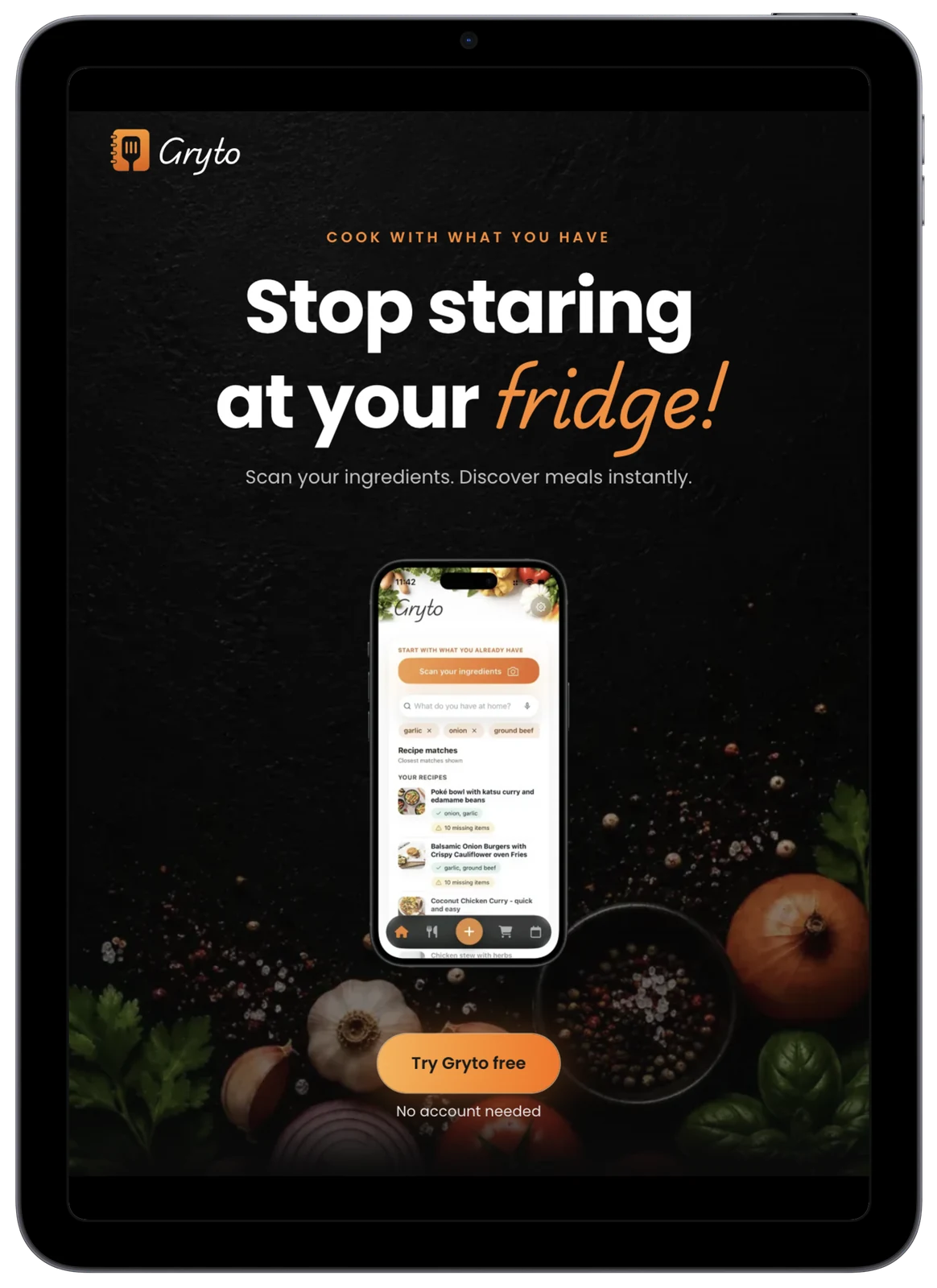
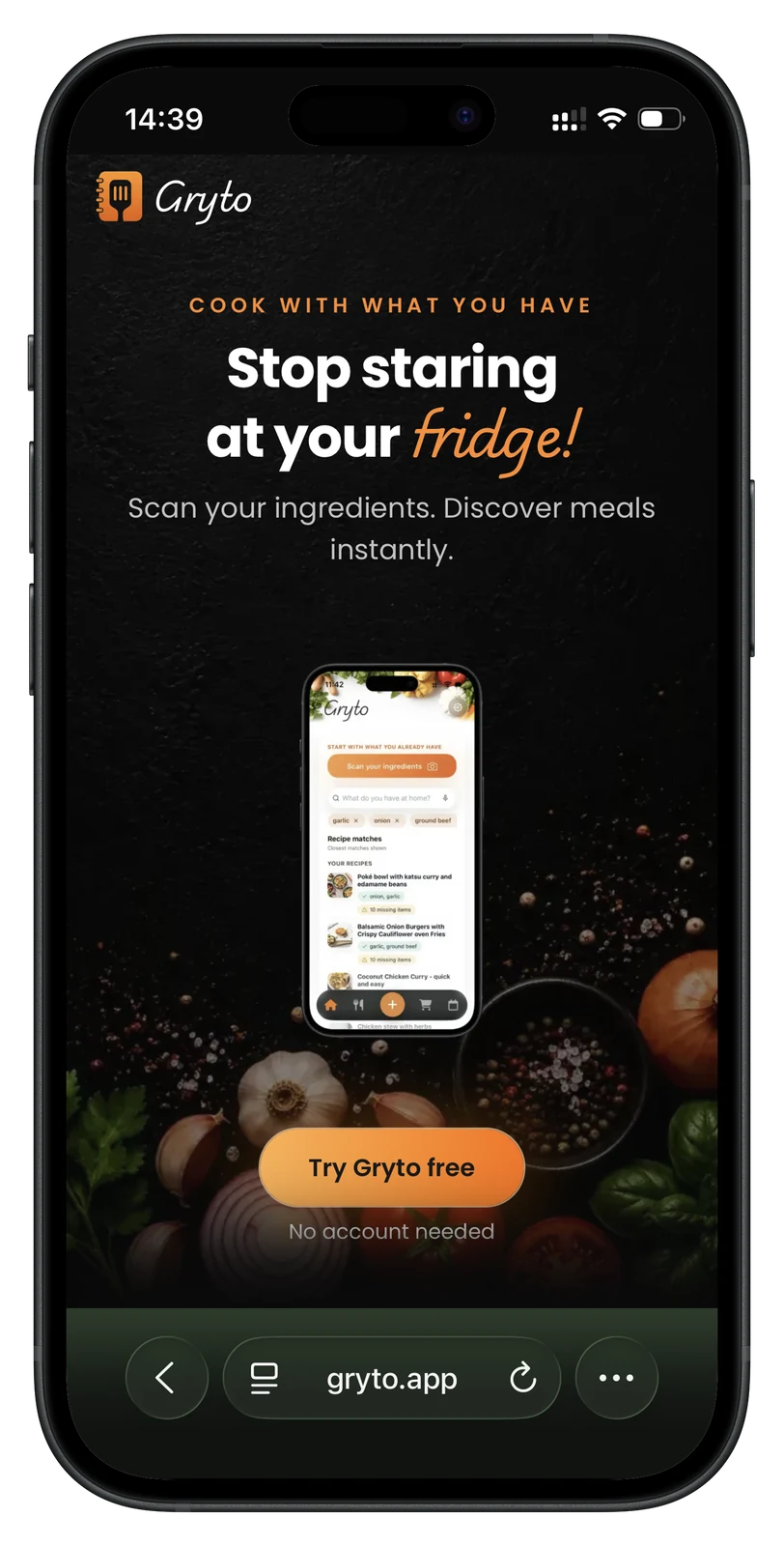
Whether someone lands from a phone in the kitchen or a tablet on the counter, the site stays fast and fully responsive, presenting Gryto cleanly on any screen while keeping the path to sign up short.
Let's talk
Have a project in mind?
Tell us what you want to build. We'll help shape a clear plan, timeline and budget.